Marco Tabini’s article on the MacWorld site is the latest to point out the “steadily escalating war against the filesystem”, in this instance waged by Apple but Microsoft and others have been conducting operations in this arena also.
Marco unfortunately cites packages as an example of an anti-filesystem “thing”
invented by Apple, which is wrong on two fronts: first, they really don’t
imply anything about filesystems or otherwise, and second it was arguably NeXT
that came up with the idea in this particular context, though even they
couldn’t have claimed it as a unique innovation (the Acorn Archimedes, which
pre-dates the NeXT machine by a year, also used folder-based applications).
History lessons aside, though, the anti-filesystem rhetoric is a mistake,
founded on a whole pyramid of mistakes. The first and most important of these
mistakes is the assumption that the end user is a total, gibbering idiot.
Indeed, it is easy for any software developer to see how such an assumption
might come about, given some of the queries we have to deal with day-in
day-out, but fundamentally the idea of a hierarchical filing system is no more
complicated than that of a filing cabinet. Would you be offended if I decided
you were such an imbecile that it would be unthinkable that you could fathom
the complexities of a filing cabinet? Yes, and rightly so.
I want to divide this post into two parts. In the second, we’ll examine why
it is that users find the notion of the filesystem so confounding. But first,
let’s consider the alternative model that is usually proposed.
The “Document-centric” Model
Those opposed to the notion of the filesystem like to talk about a
“document-centric” interface. So, if I create a wordprocessor document in
Pages on my iPad, or even in iCloud using Pages on my Mac, that document
“lives” somehow “in” Pages.
At first glance, this seems a great idea. If you ask users (who are most
certainly confused) where their documents are, they will often come up
with explanations like “I saved it in Word”. And as any computer-literate
person knows, woe betide you if you use Word on someone else’s computer to
open a file that isn’t in whatever default location the Open dialog shows.
There is a high probability that the result will be that said someone else
will excoriate you for “fiddling” and “losing all their documents”.
So where’s the problem? Clearly it fits with user expectations as to how
things behave, and that’s normally a good thing, right?
The problem is actually exposed rather neatly by the UI for selecting
documents that has been adopted in some iOS software that uses this pattern.
Earlier versions of the iWork applications, and also Omni Group’s software,
used a file chooser that looks a bit like this:
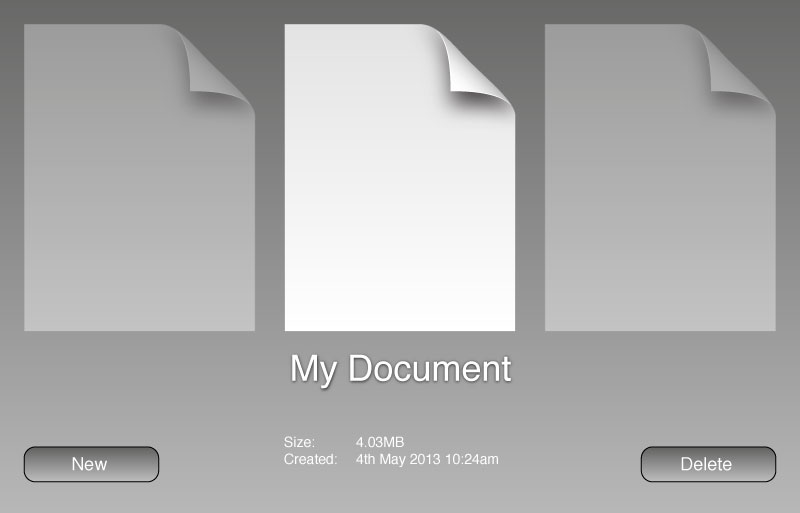
If you have more files, you can swipe left and right to see them.
Unfortunately, this interface is only any use if you have only a tiny number
of documents, and so a more recently both Apple and Omni have changed to a
grid-based chooser, like this:
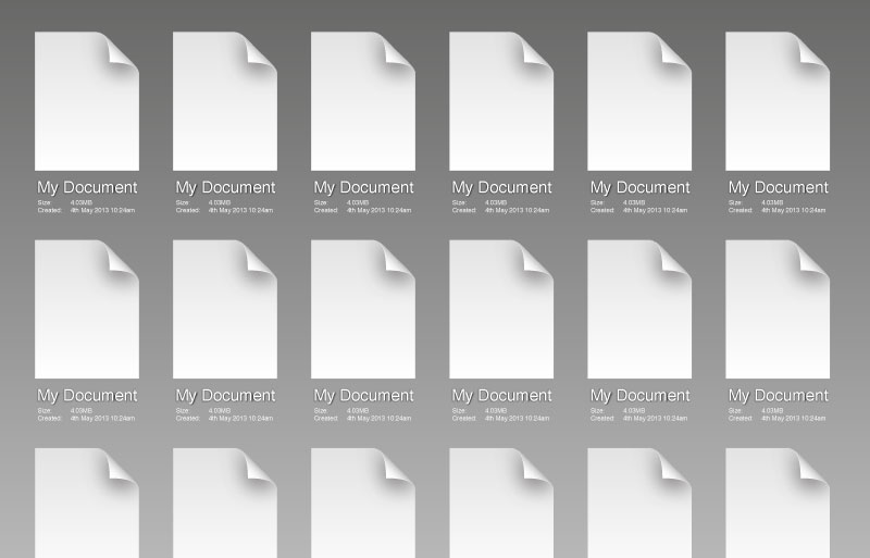
Looks great, right? Until you realise that now all my documents about animal
husbandry are going to be mixed up with the letters I’ve sent to my bank, the
copies of that report I wrote for work, etc.
What’s the logical method of fixing that, you ask? Well, Apple has already
showed the way by adding groups to the iOS SpringBoard app (that’s the
application chooser, for those who don’t know). Let’s take a look at that
too:
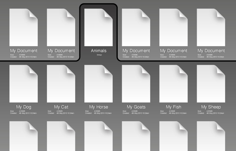
Wow! What a great interface, right? Well, sure, it’s OK, though what you’ve
really done here is invented a rubbish new version of a hierarchical
filesystem.
Yours has exactly one level of hierarchy (so I can’t further group my animal
documents by type), and probably a small limit on the number of items per
group too. It is also a little sparse on the metadata front — we know the
name of each document, its size and the date it was created, but a typical
modern filesystem can manage quite a bit more data than that.
Oh, and to cap it all, every single application has to implement this
functionality itself, and may implement it subtly differently. For instance,
maybe it isn’t permissible to have two files with the same name? Perhaps
there are restrictions on the lengths of filenames? Or on the sizes of files?
Additionally, because every application only has access to its own files (and
exactly how they’re stored is in any case up to the application), it’s
really hard for any other application to access your “My Horse” document,
even if that’s what you as an end user want. You can, of course, use hacks
like huge long URLs to pass data between applications, but that risks losing
valuable metadata and may also create security holes in the user’s web browser
in the process.
Summary: In order to fix the problems with your “document-centric” vision,
you’ve been forced to reinvent the hierarchical filesystem. But your version
is a bit rubbish compared to even the worst present-day filesystem.
Instead of re-inventing the filesystem in the name of getting rid of the
filesystem, could we, perhaps, just use the filesystem?
So what’s wrong with the filesystem
It’s easy to see that when people talk about wanting to “get rid of the
filesystem”, what they really want to do is to remove the confusion that users
seem to experience when presented with simple filesystem tasks on modern
computers. Unfortunately, rather than examining the cause of this problem,
too many designers and developers have jumped immediately for what they see as
the solution.
So what is the cause? Well, back in 1989, I got my first 32-bit micro, an
Atari ST (yes I said 32-bit, and yes, I mean 32-bit; only the PC was 16-bit…
the Atari, Commodore and Apple machines of the era were all 32-bit from the
outset). It had, like the Apple machines but not entirely like Commodore’s
line, a ROM-based operating system, and so when you looked at your disks, the
chances were fairly good that they were empty. That is, the entire area was
yours to use as you pleased.
If you bought an application for your machine, it would come on disks, but
most likely you’d have a favourite disk or disks and you’d just copy the
application and any files it needed from its distribution disk to an
appropriate place on your disk(s). Yes, there were some things that were
fixed (e.g. the Atari range would run, on boot, anything in a folder called
“Auto” in the root directory of the disk in their A: drive, they might
also load a file called “desktop.inf” containing the GEM Desktop’s
preferences, and so on). But the number of those things was small, and for
the most part the disk was yours.
When I first got a hard disk, a huge monster with only 20MB of storage in
total, the situation was very much the same. My C: drive was mine. Yes, by
that time I had a multitude of programs in my “Auto” folder, as well as some
“desk accessories”, and I might have had a few more config files, some fonts
and so on lying around, but overwhelmingly the layout of my files and folders
was my own. I knew where to find my documents on the finer points of
train-spotting because I put them there.
The “filesystem is hard” problem started, I think, on the PC. I think it
started under DOS, where some business applications shipped with relatively
large numbers of files that needed to be copied into a directory in order to
run (in contrast, even relatively large pieces of software on the Atari
platform tended to consist of a couple of files). There were good reasons for
this; DOS programmers weren’t being idiotic — they just had to deal with
limited address space (640KB) and if they wanted to e.g. print something, well
then they’d need drivers for every available printer, because DOS didn’t know
how to do that. (Contrast: the Atari platform was a GUI with a virtualised
graphics device interface, and so drawing to the printer was basically the
same as drawing to the screen, though you needed to use a different graphics
device.)
So, when you bought Wordperfect or Microsoft Word or similar for DOS, the
chances were good that you’d have a few disks’ worth of files to install. You
could have copied them yourself, but that’s a bit annoying so to help you out,
they’d ship with a program that would install the software for you.
With the advent of Windows, matters became worse. Windows was a large piece
of software, and it had a new feature — dynamic linking — that its designers
had enthusiastically adopted, breaking the API up into chunks and placing them
in separate library files. Plus it was graphical, and so it needed fonts
(bitmap fonts at first, TrueType later), its own printer and graphics drivers,
its own networking drivers and so on and so on. Lots of files — in fact, so
many that you might not want all of them installed in the precious space on
your expensive hard disk. Ergo, an installer was required.
The upshot of these installers is that now you have large areas of the disk
that you, the user, did not organise. Some of these areas may be fragile; if
I rename “C:\WINDOWS” to “C:\MSWIN”, will it work? And what’s this “USER.DLL”
file anyway? It looks big — do I need it? Can I delete “HPLJ4.SYS”? And so
on.
Windows also made the filesystem less accessible by creating “Program
Manager”. This was a way for Windows applications to show a single icon by
which they could be started, without the end user having to know necessarily
where on the hard disk the program file itself was installed. Arguably it was
made necessary by the messy layout of the “C:\WINDOWS” folder, which contained
a fair number of applications that shipped with Windows itself, but which was
very definitely a fragile area where user tampering could cause trouble.
Additionally, the Windows “File Manager” was nothing like the interfaces
provided on the Atari ST, Commodore Amiga and Apple Macintosh platforms. It
had a two-column user interface reminiscent of its “MS-DOS Shell” predecessor;
this interface is far from intuitive, and to many users File Manager would
have been a total mystery. (Contrast: the Atari ST came with a disk that had
a training program on it that taught the user to use a mouse, to create and
navigate through folders and to copy, move and delete files.)
Given the ever larger number of files shipping with major software packages
for Windows and the fact that File Manager and COMMAND.COM are fairly poor user
interfaces for an unfamiliar user, the installer was here to stay. How many
files did Word 2 install on your machine? Do you know? Do you know where?
Most users didn’t, and most users didn’t care.
Some other unfortunate design choices at this point made matters much worse
than they had to be. The Windows “Open” and “Save As” dialogs were similar in
design to those on other systems, but because of the lack of a proper
equivalent to the Macintosh Finder, the GEM Desktop or the Amiga Workbench and
because of the reliance on installers, fewer and fewer users had ever really
seen the filesystem. Mostly they’d typed in a few arcane commands, or even
booted their machine from a disk that installed Windows automatically, and
then inserted some disks that installed Microsoft Office, and that was that.
As a result, when presented with these dialogs, users often didn’t know what
they were looking at. Worse, they would often default to idiotic locations,
like the “C:\WINDOWS” directory, or the install directory for the application
in question, with the result that, since the only thing in the box that the
user understood was the file name field, many users would save all their
documents in the Windows folder. Or the “C:\WORD” folder. And so on.
Now, Windows 95 made some substantial improvements, adding Windows Explorer
(and no, I do not mean the File Manager interface, I mean the entire desktop
environment), and removing Program Manager (or, perhaps more accurately, replacing
it with the Start menu). Unfortunately, a lot of users came from Windows 3,
and so were already used to not knowing about the filesystem; a lot of
developers carried on shipping software with large numbers of files, using
installers; and Microsoft contrived to make the confusion worse by adding the
“Program Files” folder and in OSR2, the “My Documents” folder, contributing
further to the impression that the user’s disk should be organised more for
the convenience of software developers than for their own purposes.
Rather than completely blaming Microsoft, let us at this point look at Mac OS
X, which didn’t inherit filesystem problems from Microsoft, but instead has
borrowed them from UNIX.
The original Mac OS was very much like the Atari ST and Commodore Amiga
systems, in that the user was very aware of the organisation of data on his or
her disks. As with all systems, over time, more clutter turned up on the
disk, particularly the hard disk from which the system was booted, but
fundamentally the Finder, like the GEM Desktop and Amiga Workbench, was
designed to quickly, simply show the user what was on the disk. If you wanted
to run an application, you navigated to it on your disk and double-clicked it;
there was no false hierarchy like that of Program Manager or the Start Menu.
While Mac OS X inherited much from Mac OS 9 and earlier, a lot of its
underpinnings came instead from NeXT, whose operating system was based on BSD
UNIX. Now, a UNIX system is inherently multi-user in nature; this is quite a
departure, actually, from previous consumer desktop operating systems, and it
has some implications. For one thing, UNIX has a notion that there might be a
systems administrator of some sort, and that it is a requirement that users
can’t tamper with the system or even with each others’ files. For another,
UNIX has a long tradition of hard-coded paths (e.g. you can rely on a Bourne
shell existing at “/bin/sh”), and coupled with the UNIX idea of a single
unified filesystem namespace, this implies again that the user cannot be in
control of the disk. Well, the root disk, at any rate.
The mistake Mac OS X makes here is the same one that the various attempts at
Linux on the desktop make — they expose the root of the filesystem namespace
to the user, and then in the case of Mac OS X go to great lengths to hide all
kinds of “special” (and fragile) folders from end users who can’t be relied
upon to understand their contents or the fact that they shouldn’t tamper with
them. More recently, Mac OS X removed disk icons from the desktop, leaving it
empty by default — there isn’t even an icon for the user’s home folder. Small
wonder new users don’t understand the filesystem if you don’t show it to them!
Finally, Mac OS X and Windows, as well as numerous third-party software
packages have made matters worse by placing all kinds of extra files and
folders in users’ home folders. I understand the argument for them being
there, but every extra file or folder of this type is contributing to the
confusion users experience when (if) they are shown their disk. Hiding it, as
Mac OS X does with “~/Library” is a half-assed solution; what if I wanted a
folder called “Library”? I can’t have it, that’s what. Hiding things also
creates problems if users want to back up their files; e.g. should I back up
“~/Library/Preferences”? Probably, but I most likely do not want to back up “~/Library/Caches”.
But the filesystem is hard
No, no it isn’t. It’s like a lady’s handbag or a gentleman’s tool box. You
can imagine putting ever smaller bags within a handbag, or even smaller boxes
in a tool box, and so can your users. You’d have to be really quite
sub-normal to have difficulty with this notion, actually.
The “hard” part is knowing that it actually exists, or that it’s a bit like a
bag full of bags in the first place, and that’s our fault as developers and
designers.
So what should we do?
Well, for one thing, stop reinventing the filesystem in the name of ridding us
of the filesystem. For another, Apple needs to ship a filesystem chooser in
iOS, and, sandboxing or no, the user needs to be able to pick any file they
like from any application that knows how to open it. That shouldn’t mean
applications automatically get access to any old file — I’m quite happy for
the user to pick it.
Second, treat the user with some respect. Stop putting system files and
application files in users’ home areas without asking. There’s an argument
for storing preference files there, and maybe even for allowing users to
install plug-ins and drivers and things, but in that case you need to add
exactly one folder (which should probably be called “System”, not “Library”,
as the chances of a user wanting a folder called “System” are quite small) and
everything should go inside it. You might even care to stick a “Read Me” file
in it to explain to users what it is. You might convince me of the need for a
“Temp” folder or similar as well. But that’s that, and neither of these
should end up deeply nested or with lots of data in them.
Third, show the user their home folder. Put it on the desktop. And show them
any disks or storage devices they attach too. Don’t hide them away, and don’t
go creating mysterious files and folders on them without being told to.
Finally, stop spouting rubbish about the filesystem. It isn’t hard, it isn’t
complicated, and users can understand and use it.